NewsCorp's S&C article pages serve ~200K+ weekly readers and contribute ~14% of subscriber web traffic. However, CTR on related-content modules ranged between 0.003%–2%, indicating inconsistent engagement beyond the article.
The goals were to boost engagement after readers finish an article, prioritise CTAs, and build trust — without adding more sponsored content or changing the article itself.
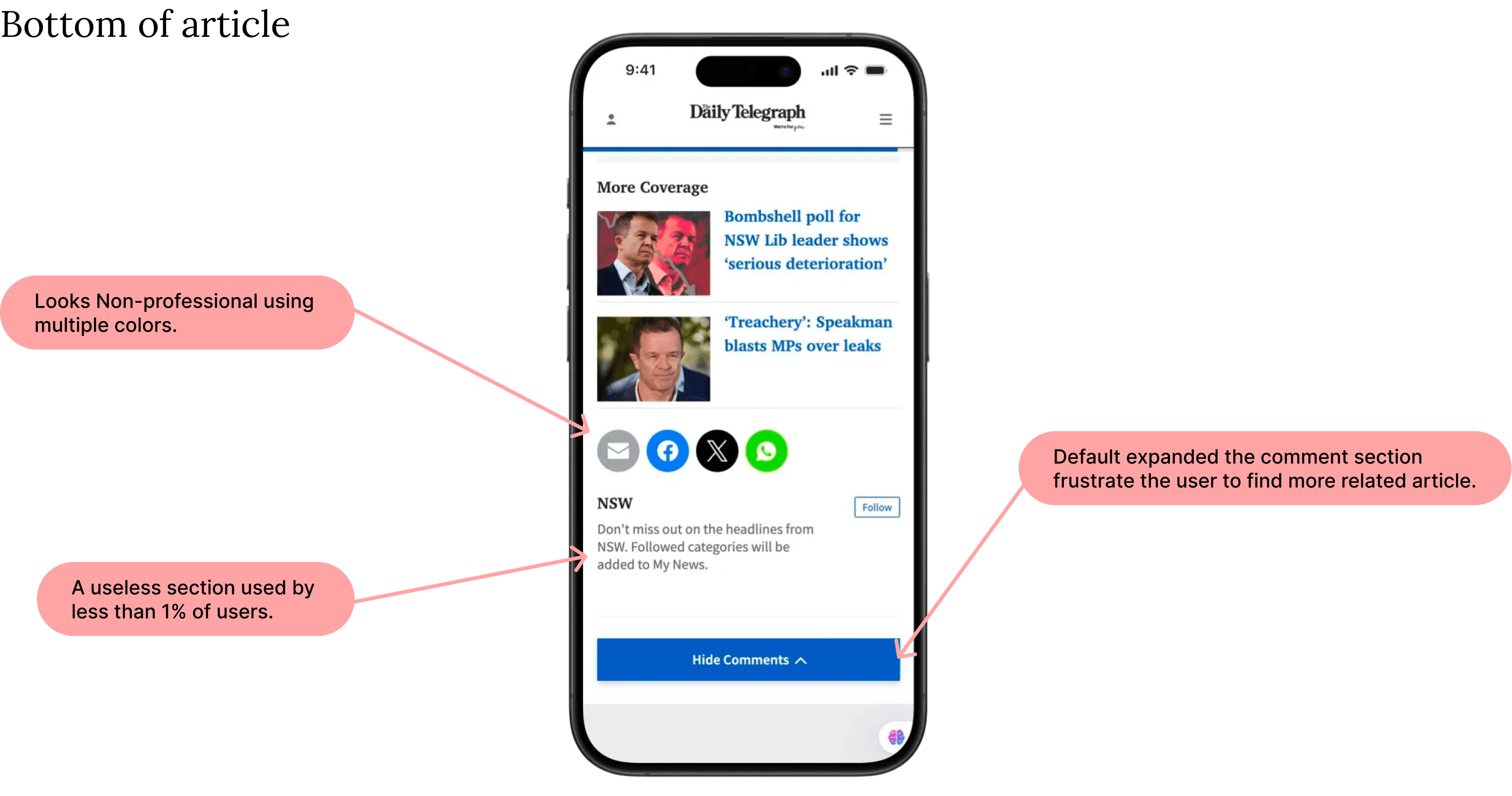
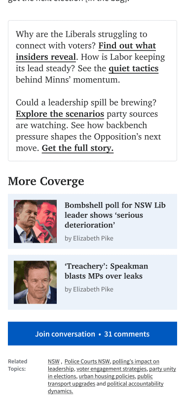
The live article experience felt cluttered and directionless. 58% of users described the end-of-article section as "not useful," and sponsored modules were often perceived as filler.
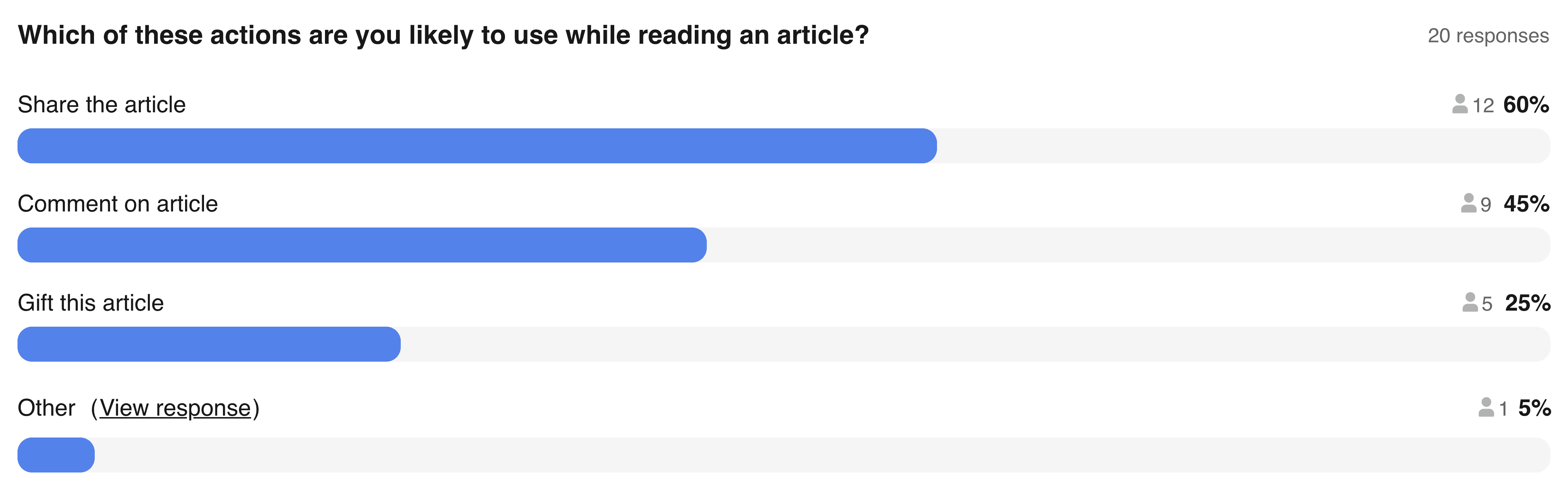
Business priorities emphasised actions like gifting — yet research showed 85% of users prioritised Share instead. That gap between assumption and behaviour shaped the entire redesign.
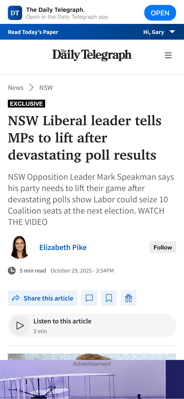
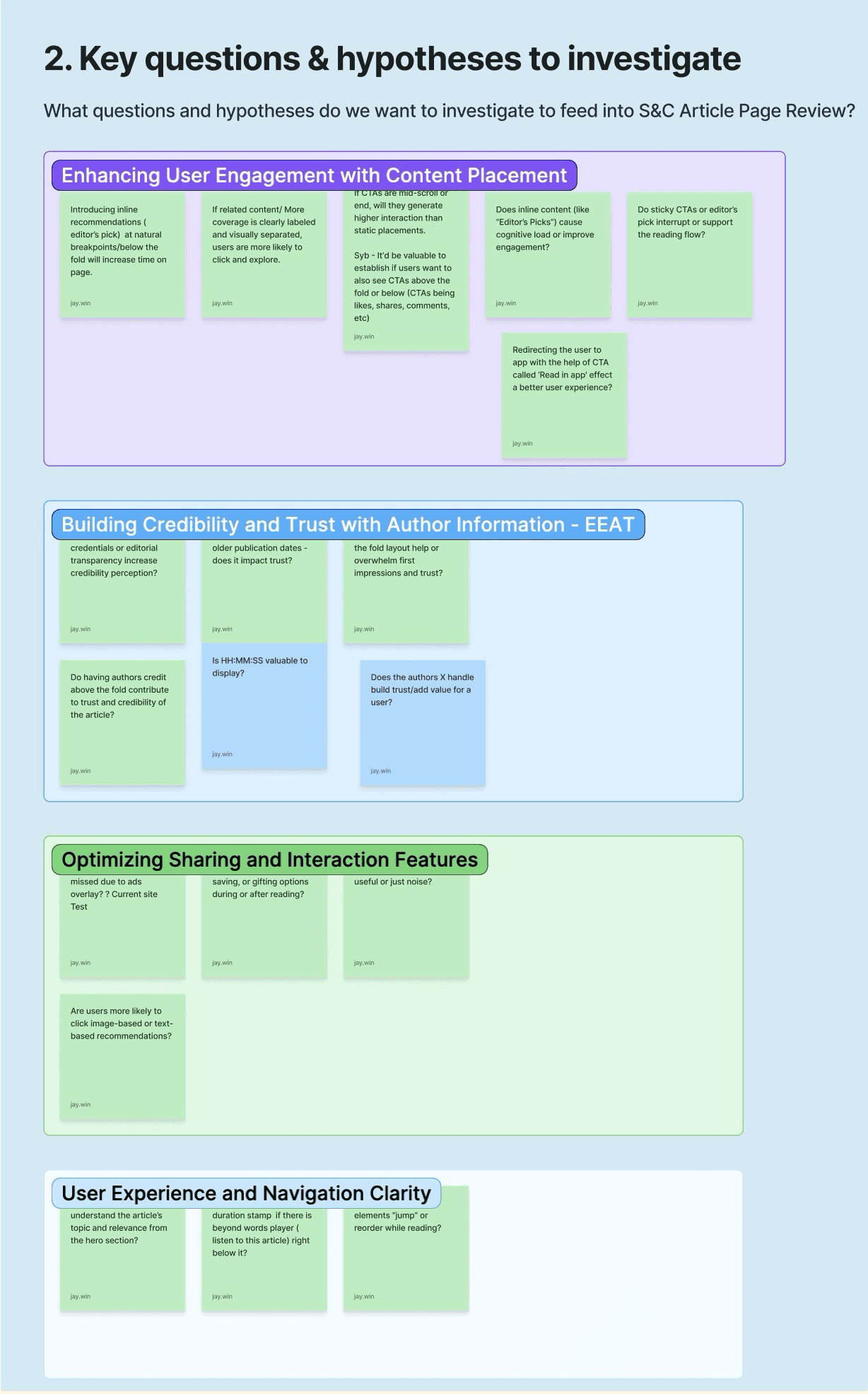
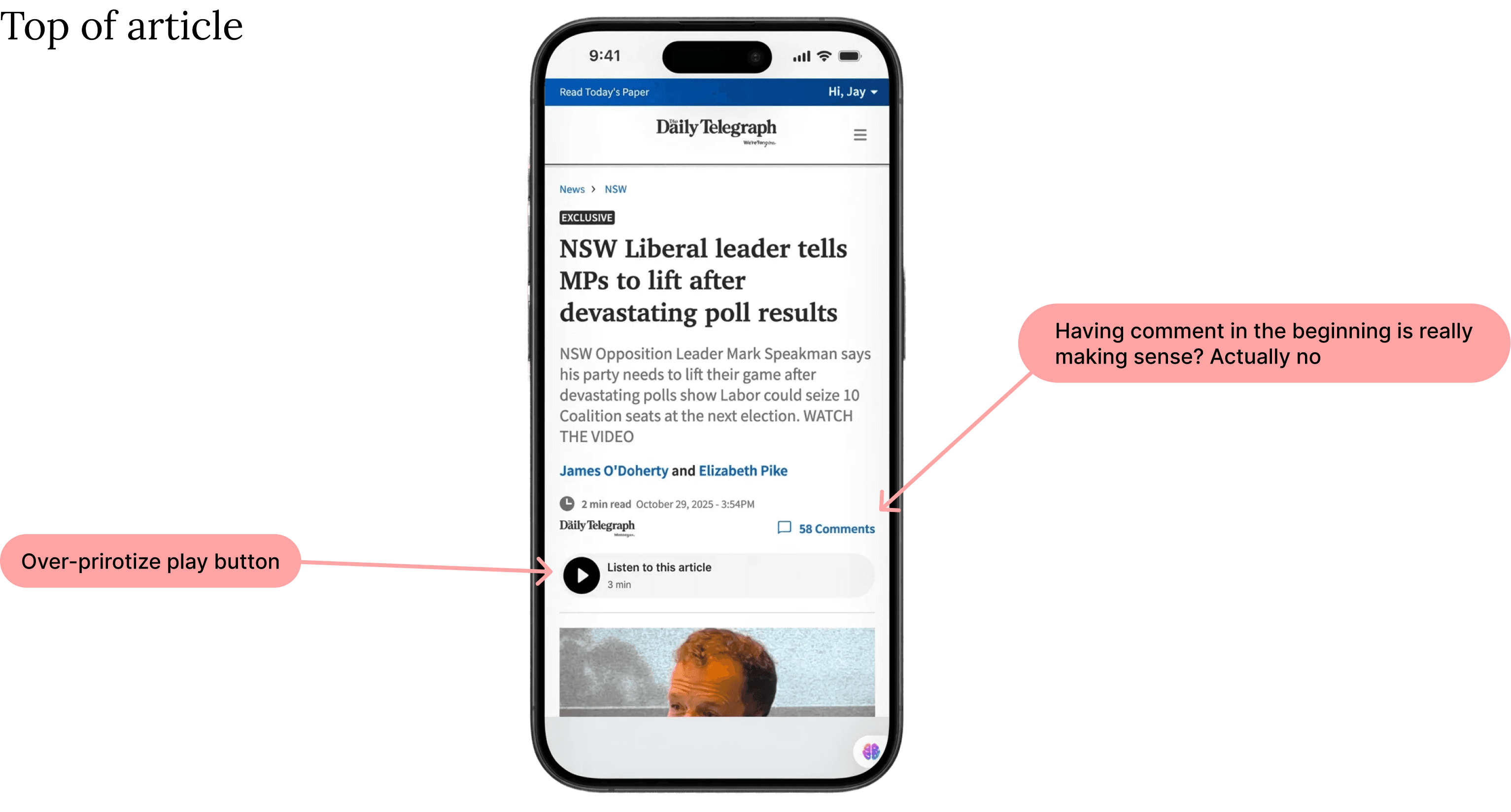
Audited the site; found issues. I took a look at the live site and found glitches hurting trust and navigation. The bottom of articles was a dead zone — nobody clicked those sections, resulting in low CTR. A perfect spot to swap clutter for something useful (or ad space to boost revenue). I also ran an EEAT analysis (Experience, Expertise, Authoritativeness, Trustworthiness) to surface structural flaws.
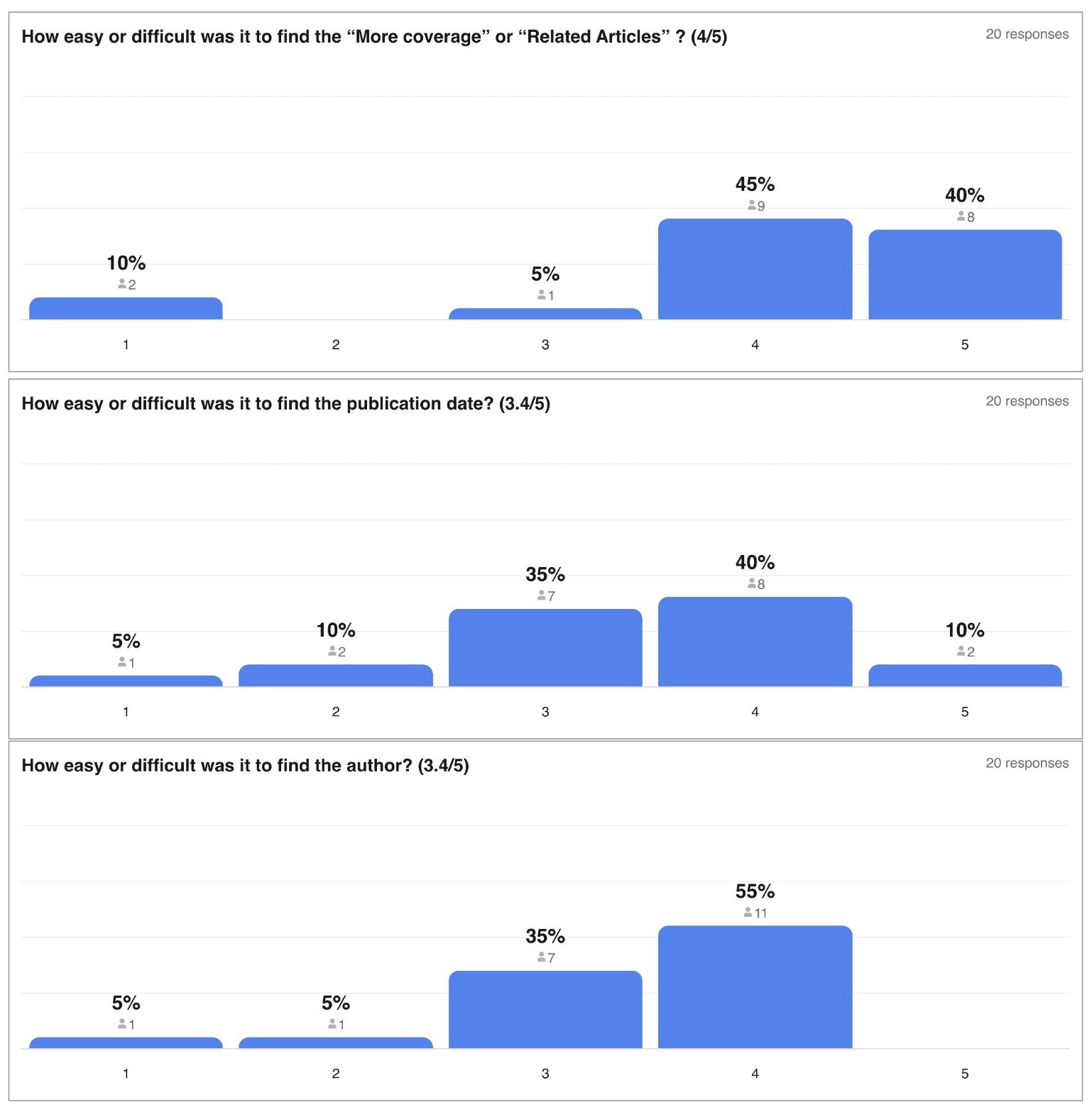
Unmoderated testing — hearing the reader's voice. Before high-fidelity UI, I ran unmoderated usability testing via Askable to validate hypotheses against the live site and survey results. Readers prioritise the Author and Posted Date as immediate trust signals, and "Sharing" was the primary intent over "Gifting" — prompting a total rethink of the action-button hierarchy.
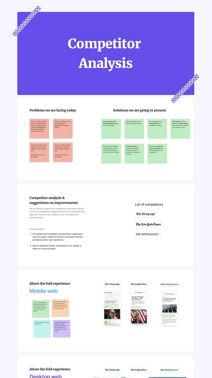
Compare industry brands. I deep-dived into global leaders like The New York Times and The Telegraph. The strategy: shift from cluttered modules to a "Value-First" layout.
Key insights:
Crafting the final MVP. In Figma I translated the research into a high-fidelity prototype, moving away from standard links toward Value-Driven modules that promise the reader a clear benefit for their next click.
Usability testing & heatmaps. I analysed the prototype against the live site with 20 Daily Telegraph subscribers, generating heatmaps from screen recordings.